
The Dyslexia Font: A Game Changer for Readers
In a world where reading is as essential as knowing how to brew a decent cup of coffee, dyslexia can throw a wrench in the works for many. Enter the Dyslexia Font, a typeface designed not just for aesthetics but for functionality. This font was crafted with the specific needs of dyslexic readers in mind, and trust me, it’s not just a pretty face.
What Makes the Dyslexia Font Special?
First off, this font isn’t your run-of-the-mill typeface. It was designed by someone who knows the struggle firsthand—yes, a dyslexic individual. The font focuses on enhancing legibility and reducing reading complexity. Think of it as the superhero of typography, swooping in to make reading less of a mental gymnastics routine.
Here are a few key features that set it apart:
- Heavier Bottoms: The letters are designed with heavier bottoms, which helps to anchor them visually. This means that when you're reading, your eyes won’t be doing the cha-cha across the page.
- Wider Openings: The characters boast wider openings, making it easier to distinguish between similar-looking letters. No more mistaking a "b" for a "d"—unless you’re just having one of those days.
- Less Mental Effort: By reducing the cognitive load, readers can navigate text with greater fluency. Imagine reading without the constant battle of deciphering letters—it’s like finding a parking spot right in front of the store!
How to Use the Dyslexia Font
So, how does one get their hands on this revolutionary font? You’re in luck! It’s available for both Windows and Apple computers, and there’s even a Chrome Extension to help you read online. Yes, you can finally enjoy those endless scrolls on social media without feeling like you’re deciphering ancient hieroglyphs.
If you’re interested in trying it out, you can adjust the font settings like size, spacing, and color. Plus, there’s an immersive reader option that provides a distraction-free reading experience. Because let’s face it, sometimes the biggest distraction is the cat walking across your keyboard.
Is It Worth the Investment?
The full version of the Dyslexia Font comes in at a whopping $12 a year. That’s less than your monthly coffee budget! Think of it as an investment in your reading comfort. For those who struggle with traditional fonts, this small fee could lead to a world of difference.
Conclusion
In a society where literacy is crucial, the Dyslexia Font stands out as a beacon of hope for many. It’s not just about making text easier to read; it’s about empowering individuals to engage with the written word confidently. So, whether you’re a teacher, a parent, or just someone who loves to read, consider giving this font a shot. You might just find it’s the best thing since sliced bread—or at least since the invention of spell check!


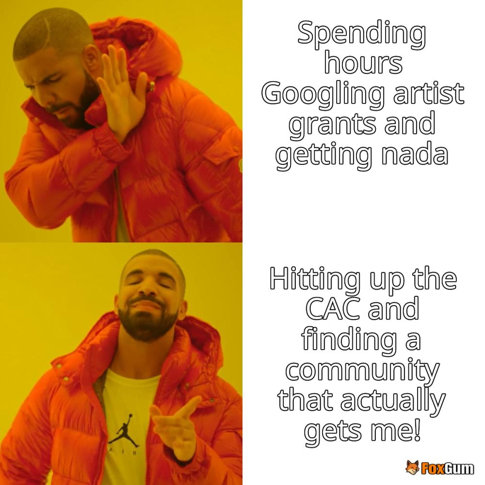
 Unleashing Creativity: Artist Resources in Chicago 🎨
 Health
  Fitness
  Lifestyle
  Tech
Tech  Travel
  Food
Food  Education
  Parenting
  Career & Work
  Hobbies
  Wellness
  Beauty
  Cars
Cars  Art
Art  Science
  Culture
  Books
Books  Music
Music  Movies
  Gaming
  Sports
  Nature
  Home & Garden
  Business & Finance
  Relationships
  Pets
Pets  Shopping
  Mindset & Inspiration
  Environment
  Gadgets
  Politics